Flourish
Packaging design, 2022
The aim of this project was to design a limited-edition label series for an organic wine brand, enhancing its existing identity while promoting its core values of purity and natural ingredients. The design process involved adjustments in label size, subtle shifts in color palettes, and thoughtful visual elements to ensure alignment with the brand’s ethos. The final outcome presents a clean and approachable design, featuring improved readability and engaging imagery. Incorporating tactile elements like embossing adds a sensory experience for consumers, reflecting the brand’s commitment to sustainability and quality. This limited-edition series effectively resonates with customers who value organic products.
Documentation Details -


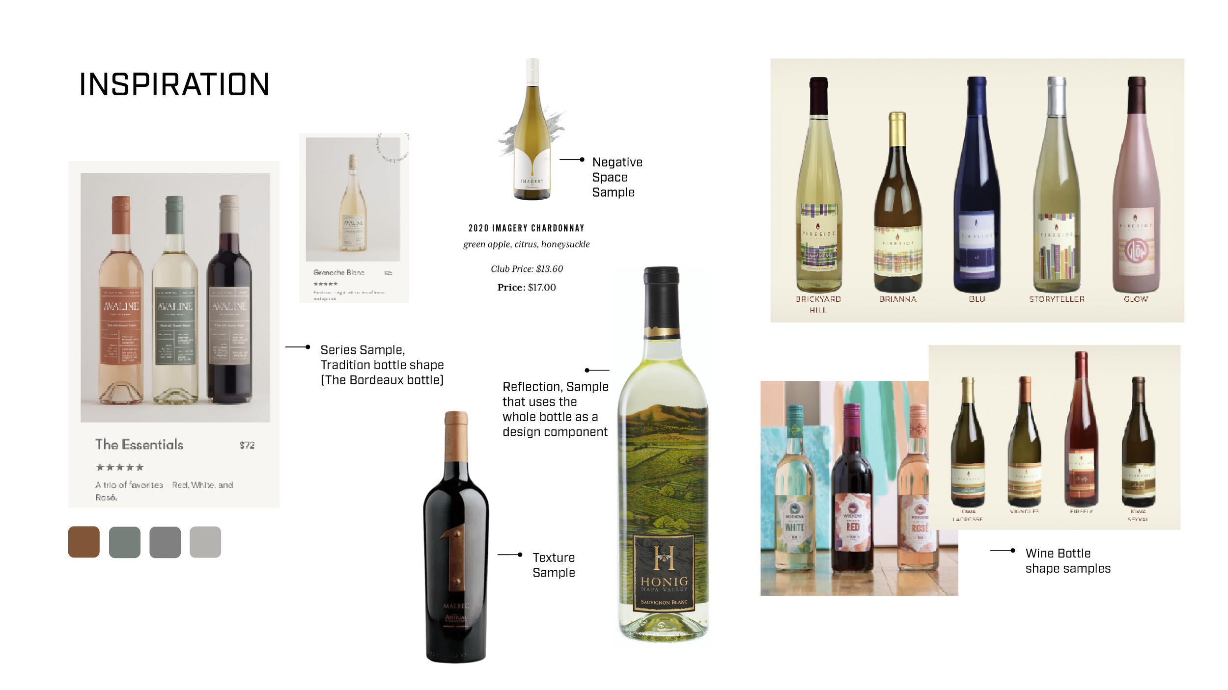
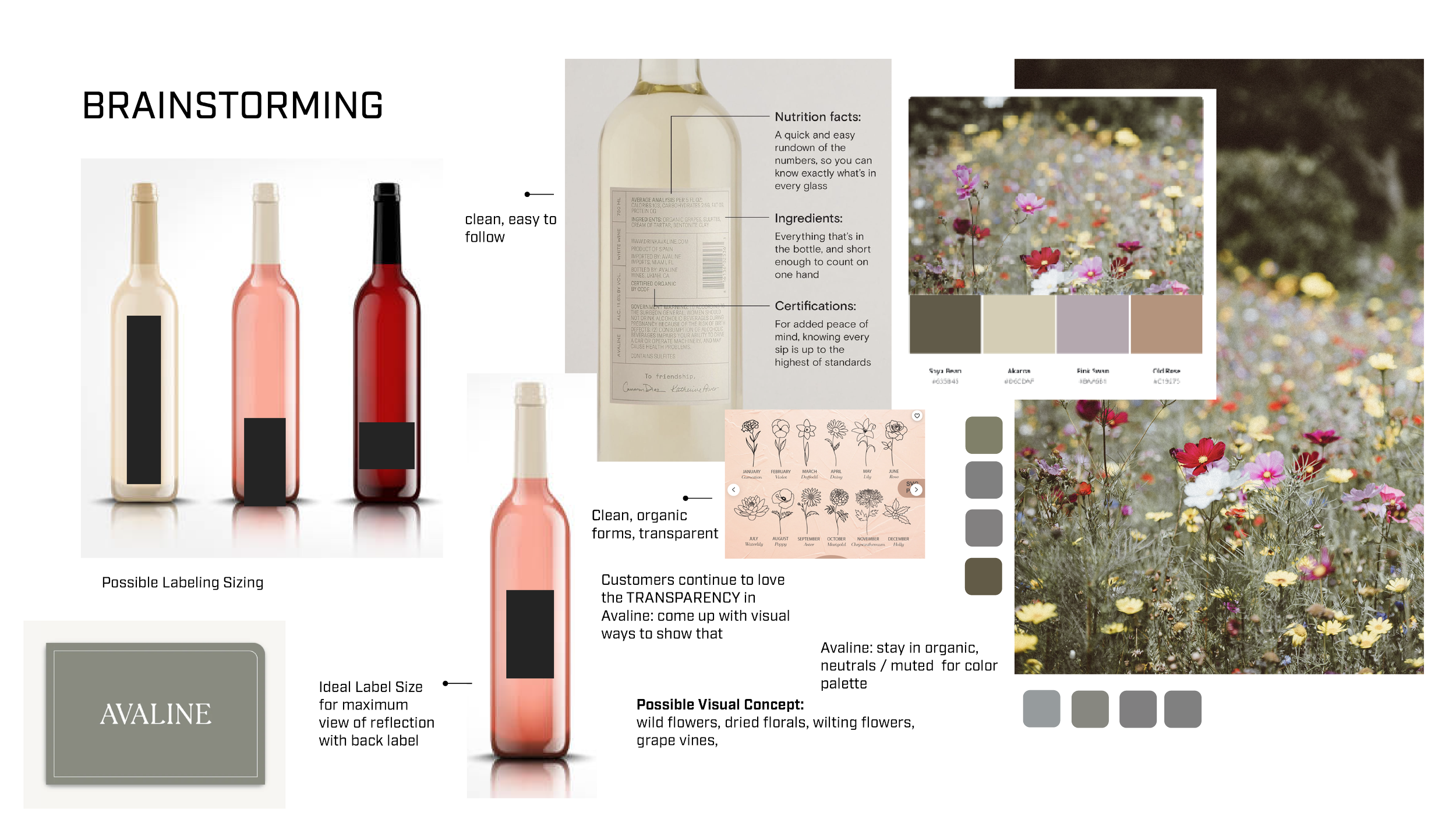
Concept Development: Ideation and Exploration
In this project, I developed a new wine label series for an organic wine brand, emphasizing its commitment to clean, natural, and pure products. During the ideation phase, I explored various aspects such as label sizing, placement, color palettes, and imagery selection. Mood boards and hierarchy studies guided the design process to ensure visual consistency with the brand's identity. To enhance the organic feel, I strategically utilized imagery that leverages the transparency of the wine bottle, allowing the design to interact with the glass rather than relying solely on the back label.
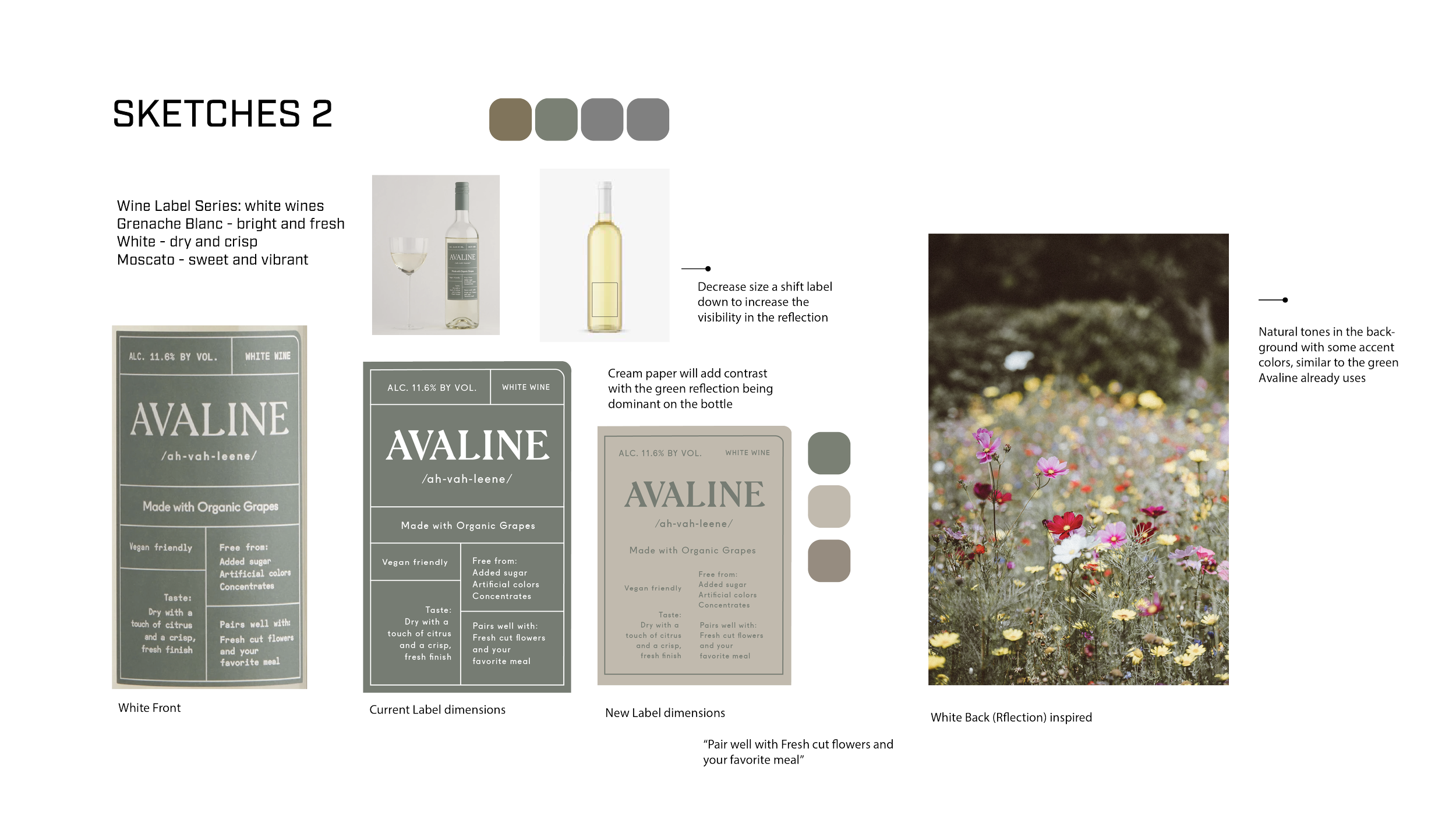
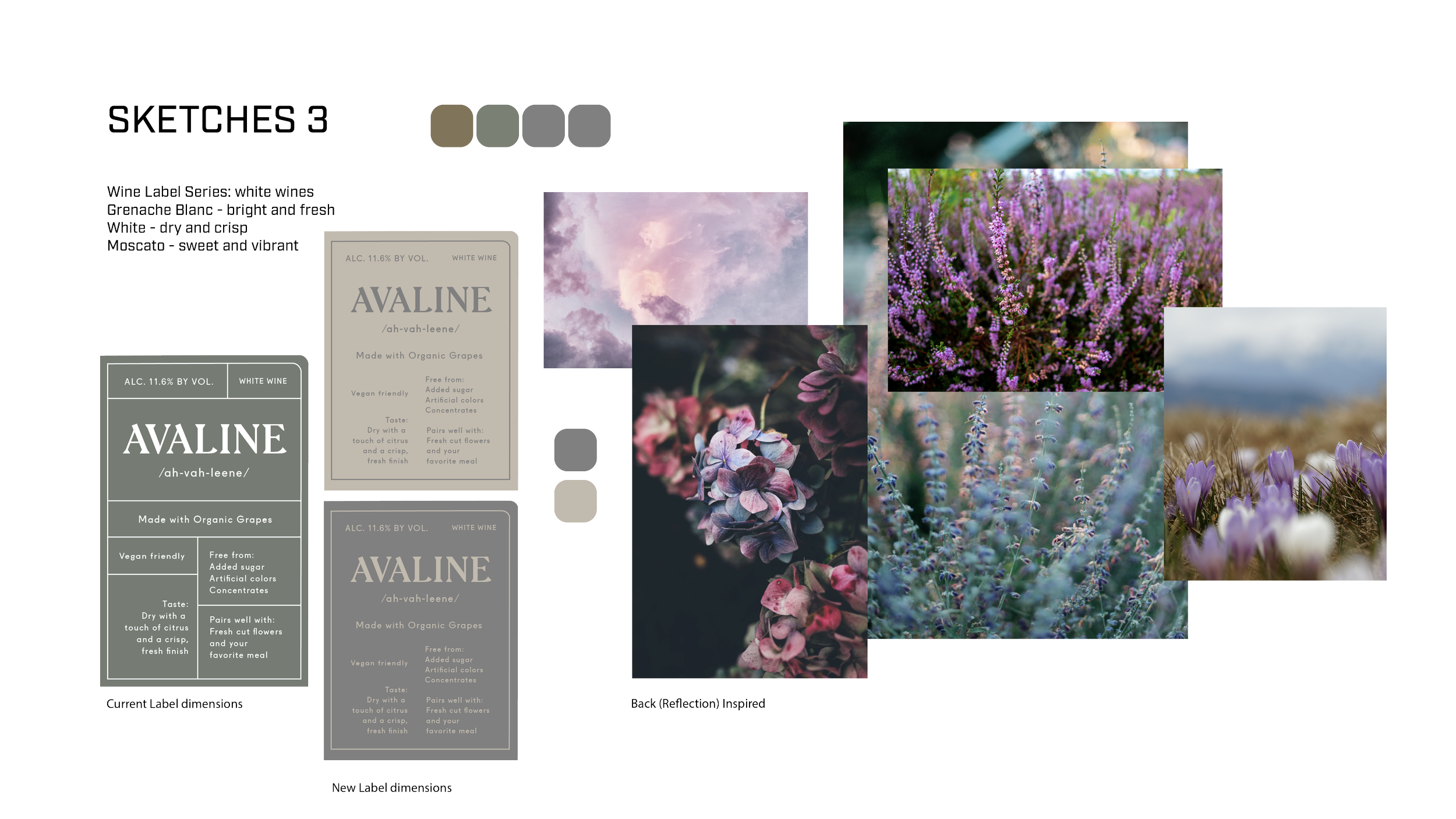
Design Refinement: Layout and Enhancements
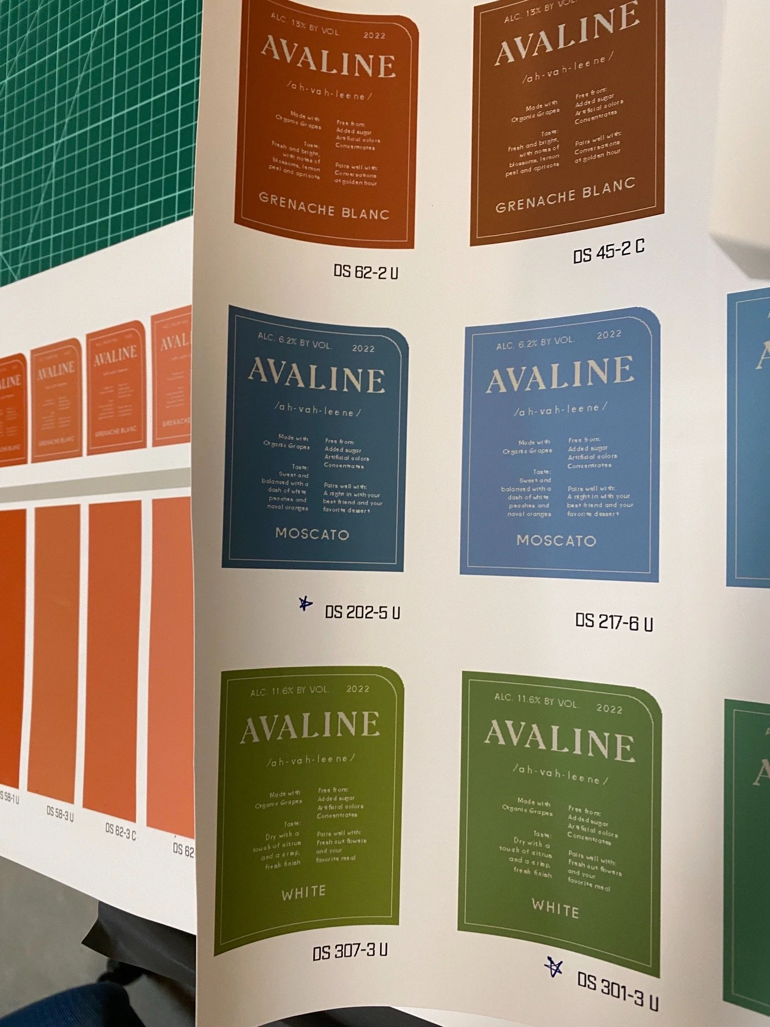
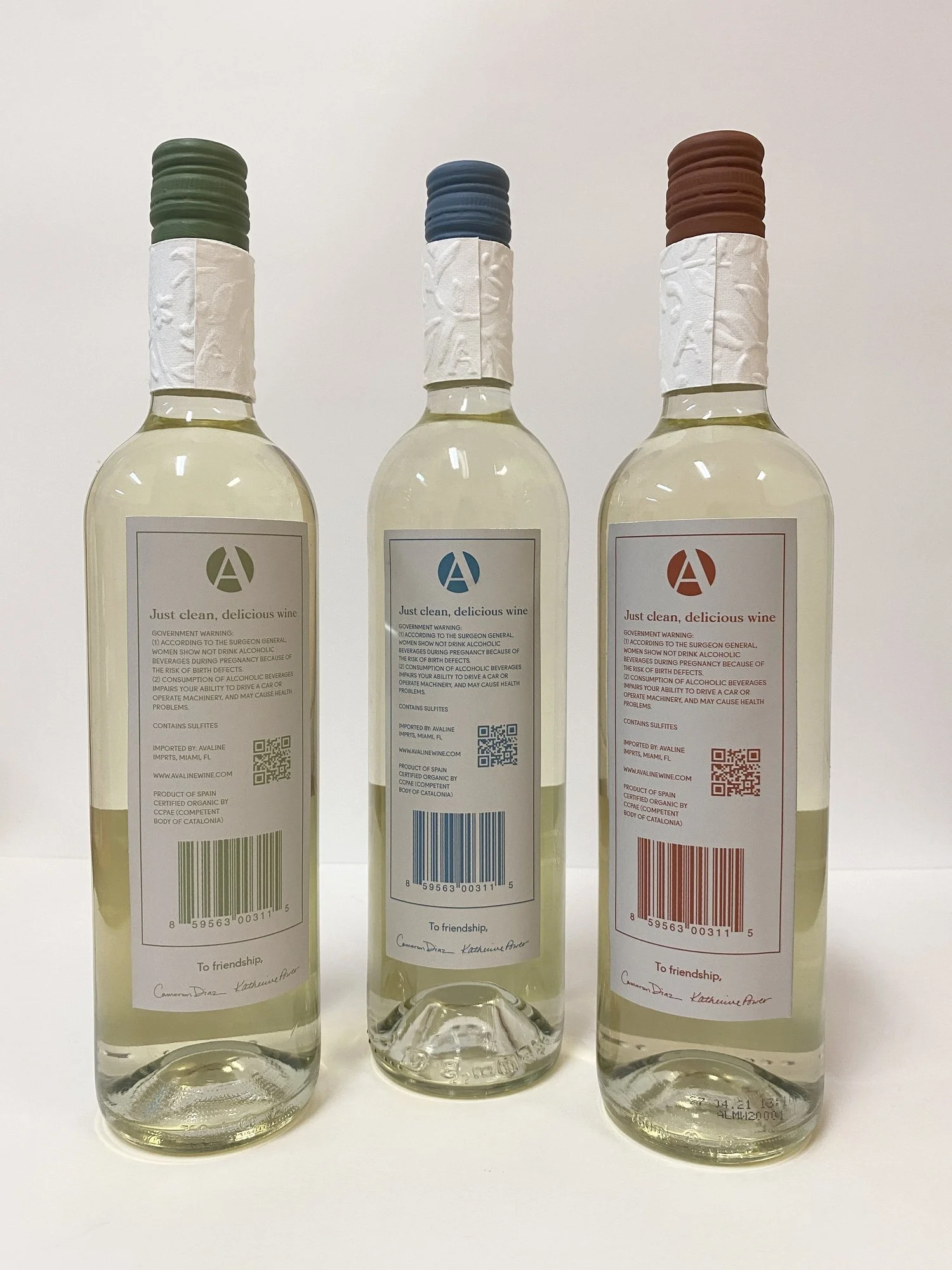
During the design refinement stage, I concentrated on enhancing the layout and color schemes to reinforce the brand identity. Key adjustments included smoothing rounded corners and refining the logo kerning for better readability. I clarified the subheader on the front label and updated the back label to incorporate a barcode, submark logo, and slogan, effectively communicating the brand's values. Additionally, I made slight reductions to the height of the front label to draw more attention to the unique imagery feature, thereby creating a more engaging visual experience for consumers.
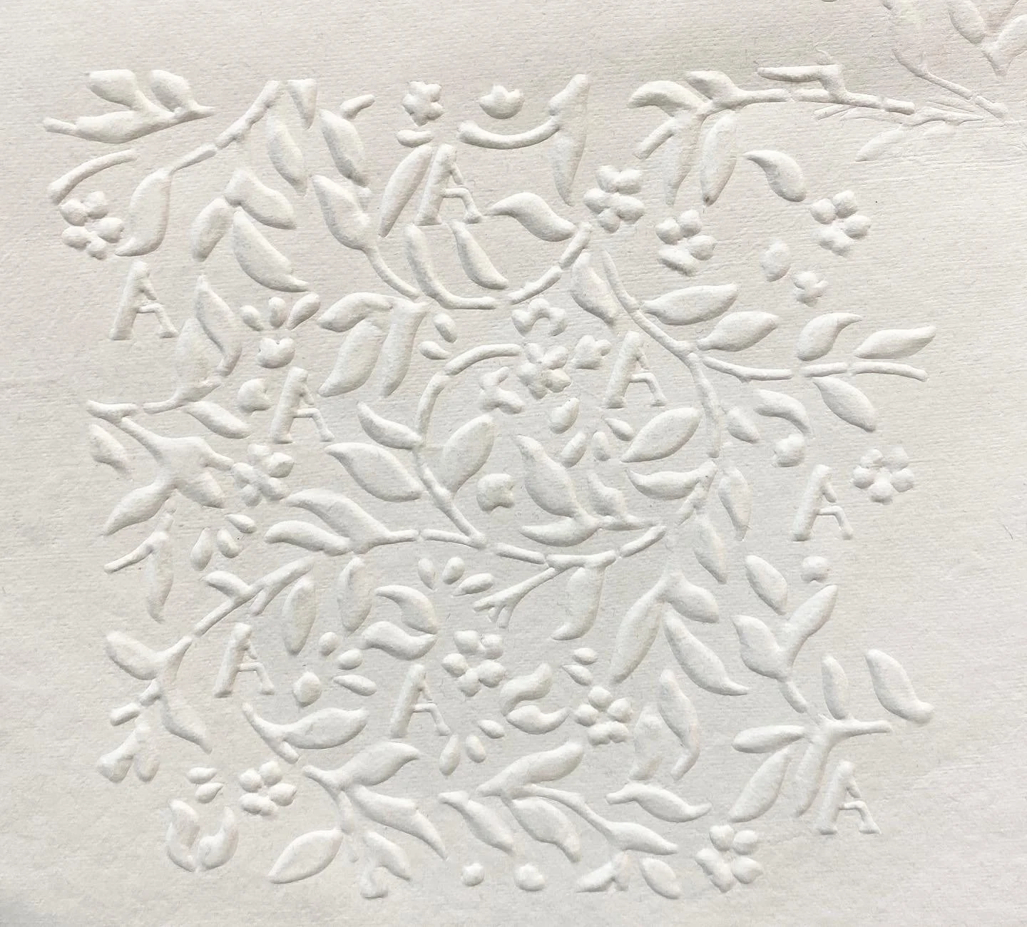
Tactile Elements: Embossing and Laser-Cutting
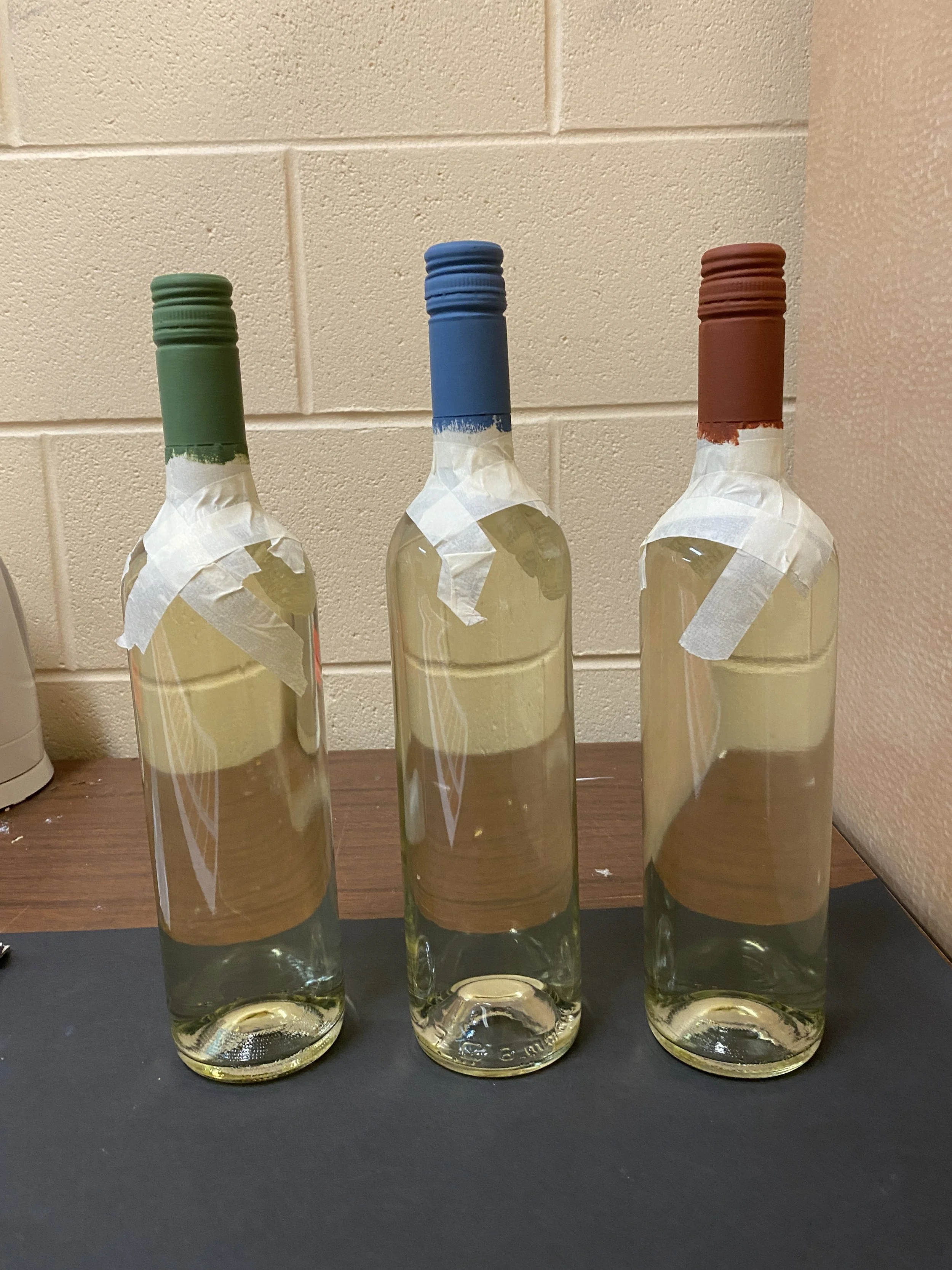
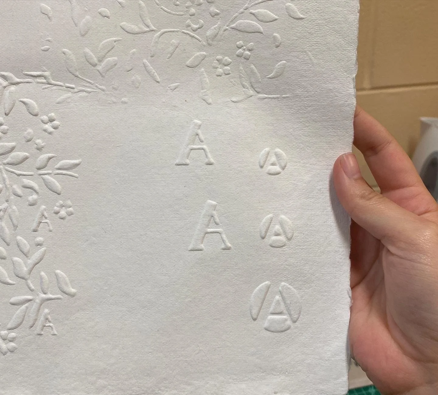
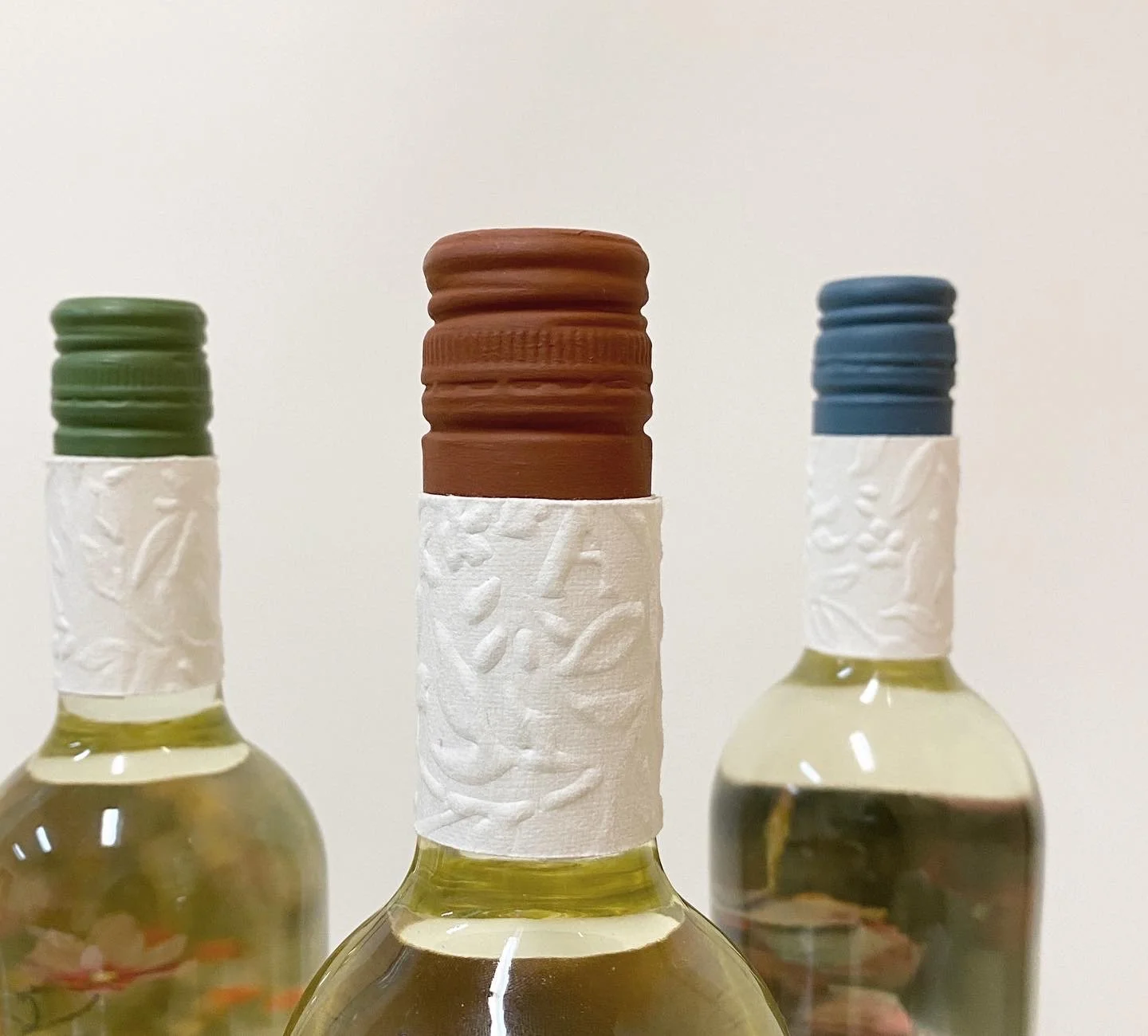
A standout feature of the packaging is the tactile element on the neck of the wine bottle, achieved through hand-embossing. I also integrated a laser-cut stencil of the "A" from the logo, which creates a modern and engaging texture that reflects the brand's commitment to organic purity and nutritional transparency. This subtle yet elegant detail enhances the brand identity, emphasizing key values such as a focus on clean, natural, and pure products. The tactile aspect further contributes to the overall organic feel of both the company and its offerings.
Final Outcome: Cohesive and Communicative Design
The final wine label series features a modern and tactile design that effectively communicates the brand's commitment to organic products. Each label blends visual elements, textures, and typography, creating a cohesive look that resonates with the brand's identity. Thoughtful imagery and color schemes enhance visual appeal, inviting consumers to connect more deeply with the product. Tactile features—like hand-embossed elements and a laser-cut stencil—add a sensory dimension, encouraging interaction. This approach ensures the packaging stands out on shelves while conveying the brand's values of purity and sustainability, ultimately boosting consumer confidence in choosing an organic wine that reflects their values.
Behind the Scenes -